Firefox Lite is a lightweight version of the Firefox browser. It's tailor-made for emerging market users (mainly in India and Indonesia) who have storage or internet data constraints on their mobile devices.
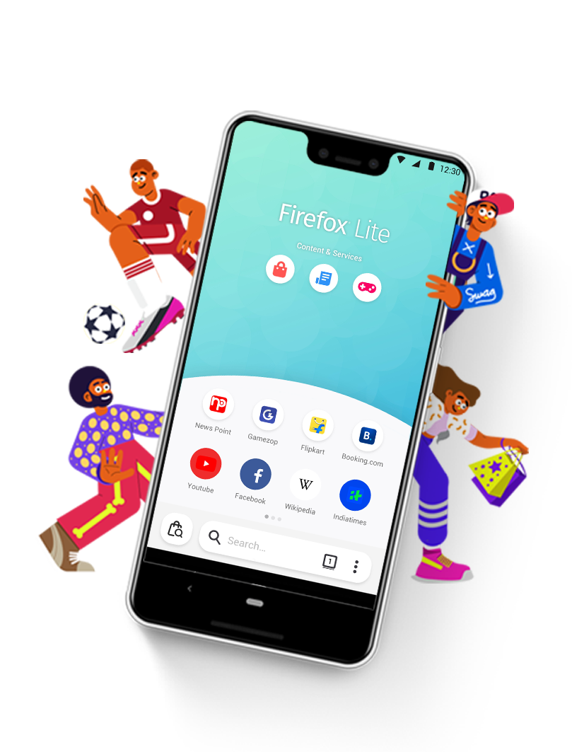
At the end of 2019, the team released Firefox Lite 2.0 with new features on Home, including affiliated top sites, Shopping, Game, News and Travel, to expand the business opportunities by transforming Firefox Lite from a pure browser to a super app.
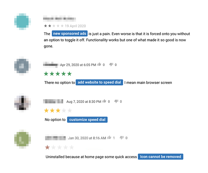
Unfortunately, users were not satisfied with the new features. The Day-1 retention rate was lower, along with a number of complaints on the Play Store about seeing ads in the browser and inflexible customization.
The churn rate was high in Day-1, so we decided to redesign the onboarding experience. Our product manager set 3 goals to the project:
It’s a short design project that took one sprint for the kick-off planning and one sprint for UX/UI design.
Therefore, I made assumptions based on the previous user research findings from Firefox Lite and Firefox desktop, then going forward to design phase.
The team consisted of 5 members participating
in the product development process.


USER RESEARCH
Framed research questions and delivered a user survey to validate the assumptions we made for top sites.
UX DESIGN
Designed wireframes, copy writing, and checked feasibility with engineers to make sure the design could be delivered in 2 sprints.
User flow #1
Most of users tended to skip onboarding messages. Before I joined the team, Firefox Lite released 2 versions of onboarding design, but none of them met the team's expectation.
There was a user research tried to understand "why". From the interviews we learned that users wanted to directly use the features instead of reading through messages.
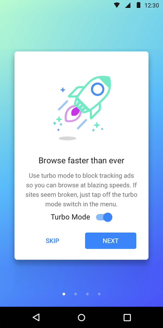
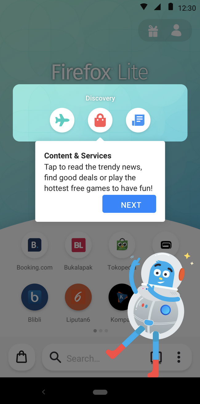
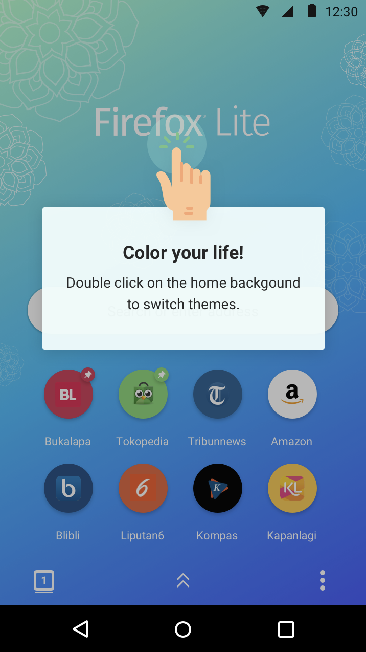
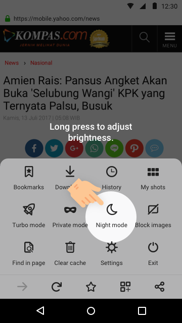
Originally, it required gestures to change wallpapers and night mode settings. Since it's hidden on the screen, the team added some onboarding dialogs to introduce them. Unfortunately, the usage rate were very low because users never read messages.
Especially for the night mode, which bundled the lower brightness and dark theme. We constantly received a huge number of complaints on Google play because users didn’t know how to adjust the brightness for night mode.
It was a huge pain for emerging market users because the environment was very dark at night.
1. Themes were promising to Firefox desktop users. Participants were wow-ed by the dark theme.
2. The behavioral data from the Firefox Lite users showed that users who set as default had a higher rate on retention. However, we had to find a good timing to ask.


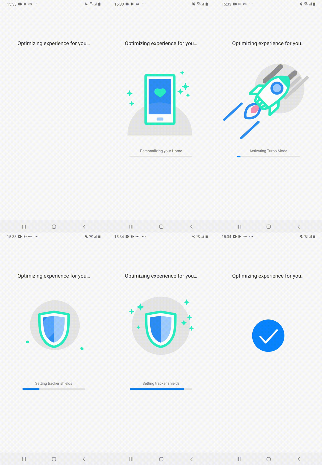
From the previous research, we learned that telling product values in text didn’t work. So we tried an animation approach in the new design.
We wanted to help users set right expectations that were aligned with Mozilla’s mission, so they could feel safe and private when browsing.
For guiding users to choose a theme, I collected the hidden wallpapers and the dark theme from the night mode in one panel.
The panel was built as a component, so we could leverage that in the menu to allow users to have a further change.
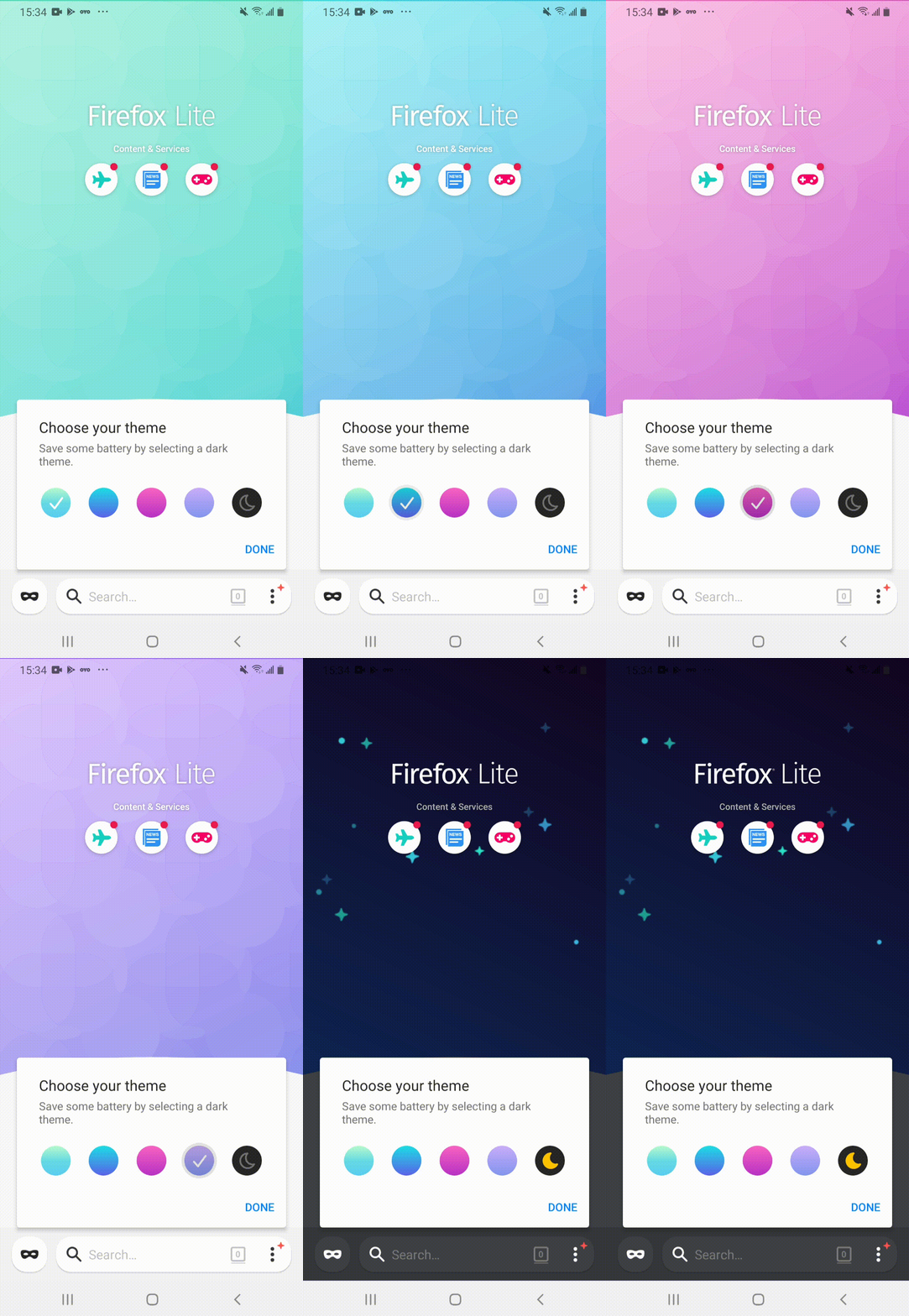
We believed that users would be fascinated by the theme settings and felt very engaged to the browser, so it should be the best timing for asking users to set Firefox Lite as default.
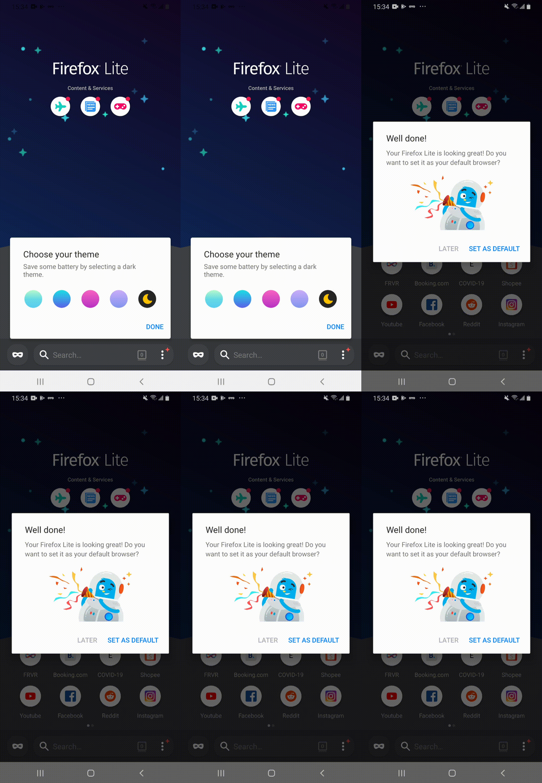
User flow #2
In the beginning, we didn’t understand the complaints about ads because there was no ads in Firefox Lite.
Therefore, I designed a survey tried to investigate:
1. Why do users complain about ads in Firefox Lite?
2. Do users view top sites as ads? Any specific category of websites (e.g. shopping sites) looks like ads to our users?

Customizing top sites must be quick and simple, because too many may deter users from exploring the browser.

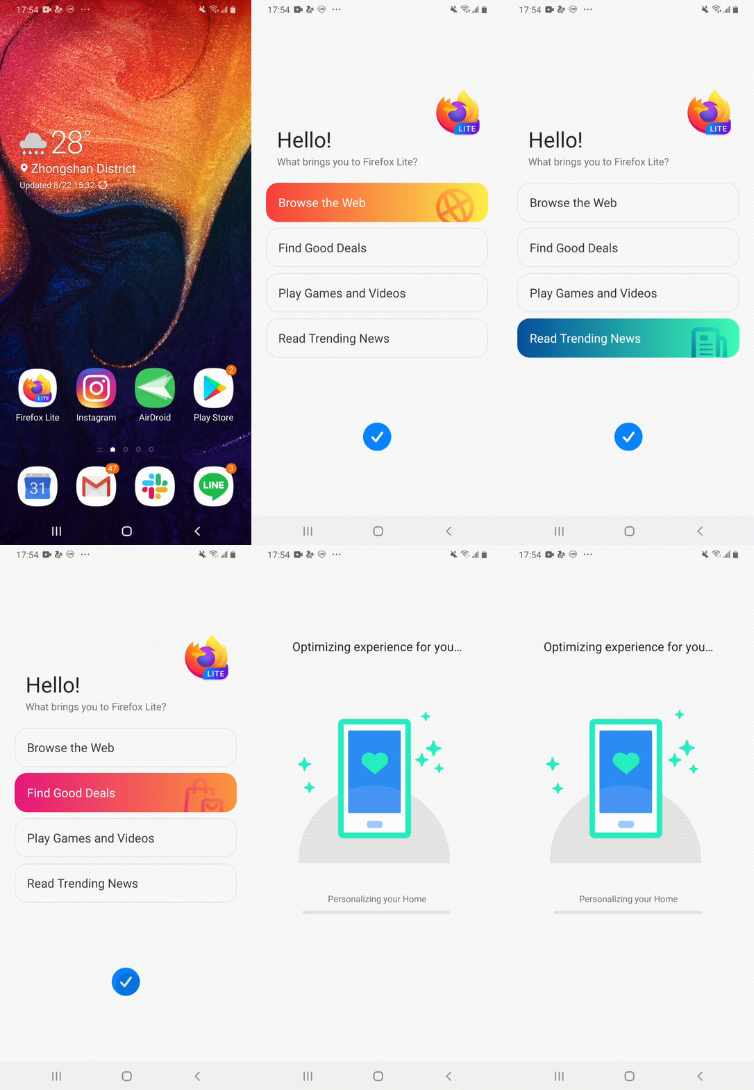
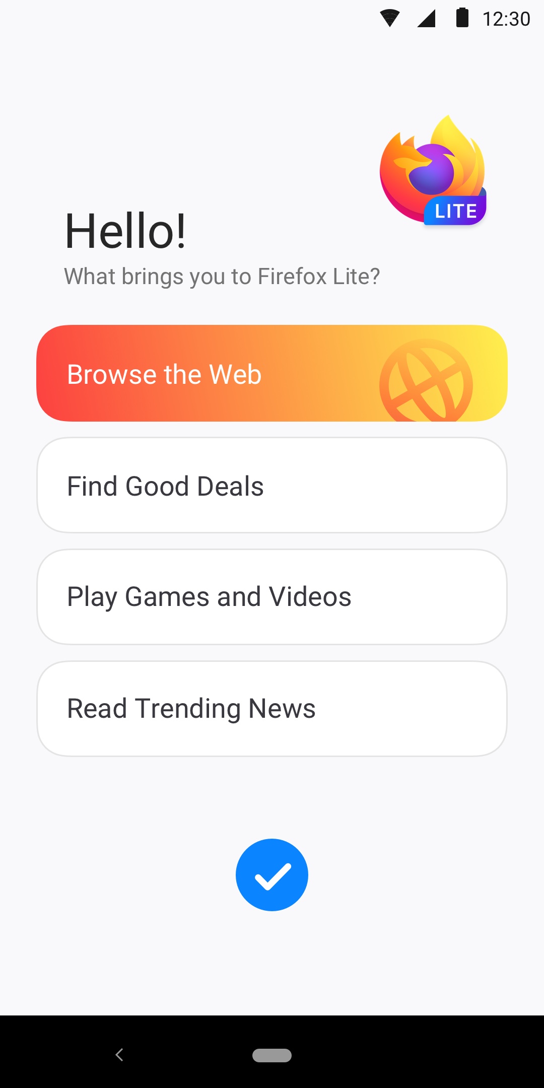
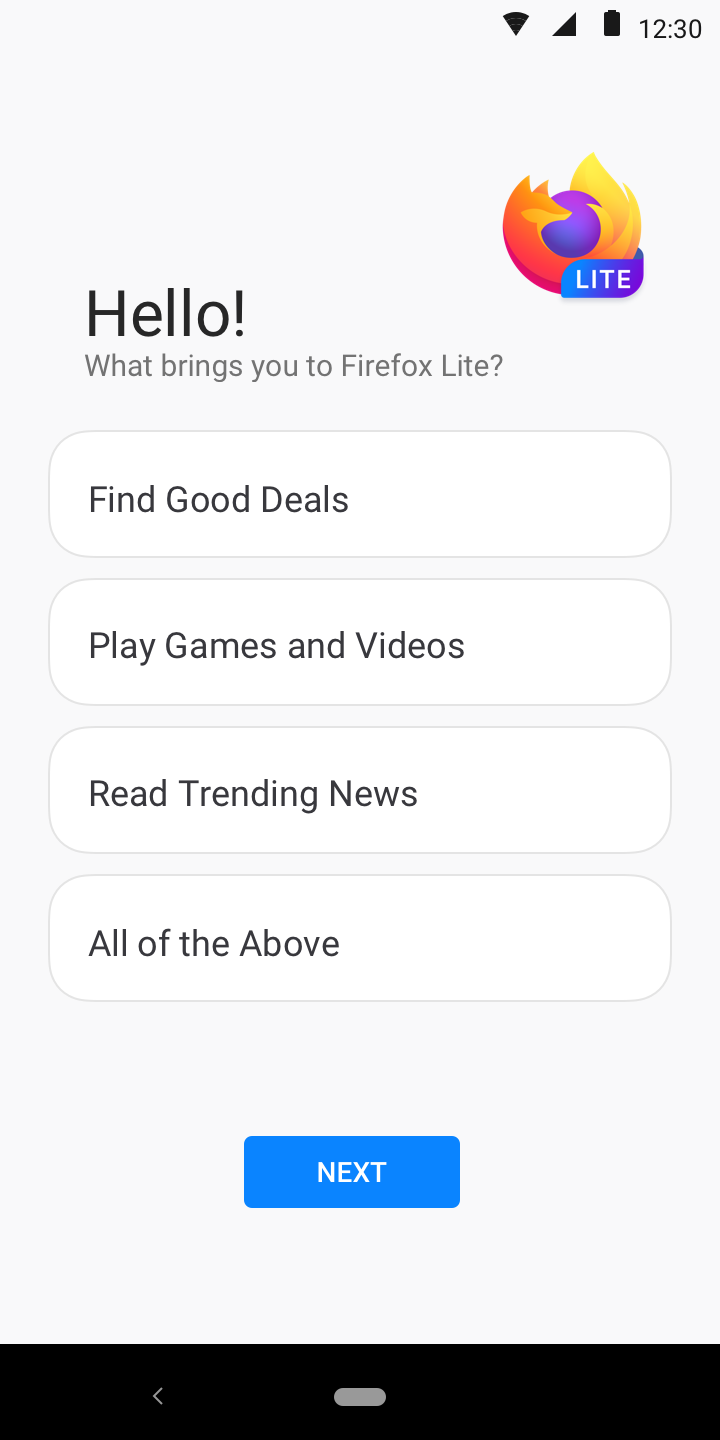
I put options on the welcome page to understand how would the users use the browser.
For example, user who choose “Find Good Deals” will see top sites like Amazon, Ebay, and Shopee on their Firefox Lite Home.
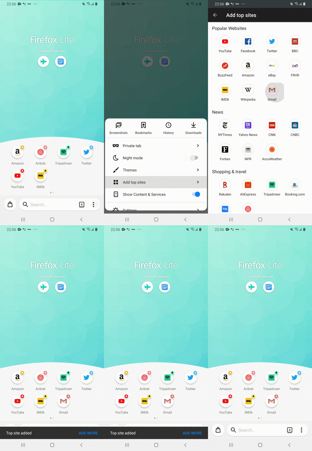
There was a website list from which users could add their new top sites.
We didn’t provide the full flexibility of adding any sites on the internet because the user need wasn’t clear enough at the time (from the telemetry data, we only saw a small amount of users pinned and removed top sites).
Therefore, we decided to provide the list as a MVP, which included our affiliate partner sites.
Outcome & Iteration
Because of the limitation of the time and resources, we didn’t add big features, but made small changes by leveraging the existing features.
The redesign has improved a lot on satisfaction:
1. The previous complaints about night mode has magically reduced. Users were very satisfied with the dark theme, which is an existing feature on Firefox Lite.
2. We barely saw complaints about ads. Instead, there were some reviews asked for more flexibility to add top sites. It proven that editing top sites is a valid user need.
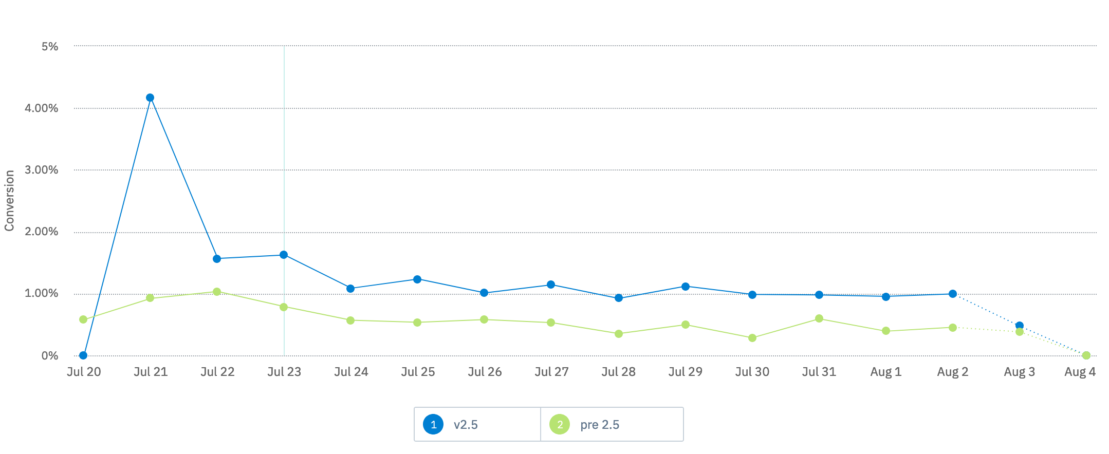
When we looked into the telemetry data, we got 2 findings:
1. There was a 5% drop rate in the first welcome page.
2. Users who didn’t choose the default option “Browse the Web” were more likely to retain.
Unfortunately, the project was suspended in the later stage. We couldn't know if the iteration works as what the team expected, but I believe it'll be the right direction to improve the conversion.